What we don’t measure

We have a lot of metrics in the NHS designed to act as proxies, early warnings, of failings.  In hospitals we monitor incidence of pressure ulcers, healthcare acquired infections, readmissions, “never” events, complaints and probably a dozen more. Then of course we have the grand-daddy of them all, risk-adjusted mortality.  (Actually we have at least three different risk adjusted mortality metrics, but that’s for another time.)  What do all of these have in common?  They predominantly tell us when things have gone wrong after they’ve gone wrong.  It got me thinking, are there things we might measure to give us a hint things are going wrong, er, before they’ve really gone wrong.

This thought was knocking around the back of my head they other day whilst in conversation with a colleague. He had previously worked in a Trust which, managerially speaking, had fallen off the rails.  I won’t relay the whole story, but the part of the tale I was interested in was of the systematic and fairly rapid loss of corporate knowledge as one by one key staff voted with their feet.

It’s a pattern I’ve seen before.

I’ve long believed that most hospitals operate on an unacknowledged network of the disproportionately proficient.  You won’t find a list of them. There’s no org diagram on which their names are highlighted.  They’ll be of widely different ranks, professions and formal status.  They certainly won’t all be directors (and sometimes none of them will be). But ask anyone who’s worked there for a while and you’ll quickly get half a dozen names reeled off at you. Many of them will have worked there for 5, 10, 15 years, seen several changes of management and kept the ship sailing throughout.  When an organisation goes really bad, these are the people who leave.

Could we measure for that? Not exactly, but we could maybe get close. My hypothesis is this. A big drain in the organisation’s senior experience predicts problems to come.

And here’s my suggested formula:

(E)xperience = the sum of years spent with the organisation for all AfC band 7-9 & VSM

(L)ost Experience = the sum of (E)xperience for those who’ve left the organisation in the last 12 months.

Experience Loss (R)atio = (L)ost Experience / (E)xperience

It’s a kind of turnover measure, but in units of years’ experience rather then WTEs or heads.

It ought to be calculable for all Trusts, retrospectively, from nationally held Electronic Staff Records.  Which opens the door to some interesting benchmarking and analyses.  Perhaps someone with more time and access than me could test my hypothesis.  Or perhaps someone’s already done it?

If so, let me know.

Help! My spreadsheet’s derailed

Watching the train franchise debacle unfolding at the Department for Transport, I find myself getting steadily more and more depressed.  Putting aside the politics of it all it seems somebody at DfT screwed up their spreadsheet models.  Models being used to assess the comparative merits of the suiting bidders.  The problems only came to light when the department was railroaded – if you’ll pardon the pun – into hiring PwC to do some due diligence.

I have a deal of sympathy with those original analysts who built the model.  I’ve built many a model myself over the years, and reviewed many others.  Building spreadsheet models is a complex business.  It’s painfully easy to make mistakes.  The research literature suggests the majority of Excel models used in business contain errors, many of which have a material impact.  You need to think of it as a form of software development (which it is really).  Good software is expensive to produce because development has to include significant design and testing phases, and a lot of iteration.  It’s not just a question of a programmer sitting down at a keyboard, bashing out a few hundred lines of code and Bob’s your uncle it all works fine.  Yet those who commission Excel models – and unfortunately a sizeable chunk of those who develop them – too often fail to appreciate this.  If you are building a complex spreadsheet model, one on which a multi-million pound decision hinges, you have to design it carefully and QA it to death.  Government departments have the capability to do this in-house, they don’t need to bring in a consultancy to do it.  What is lacking is the senior civil service and ministerial awareness of what modelling is.  A lack of awareness which I suspect in this case led to either a failure to resource their in-house analytical team correctly for the job and/or a failure to ask the questions which would have exposed the model’s lack of rigour.

Don’t make the same mistake.  Add this to your bed-time reading list:

Spreadsheet Modelling Best Practice.

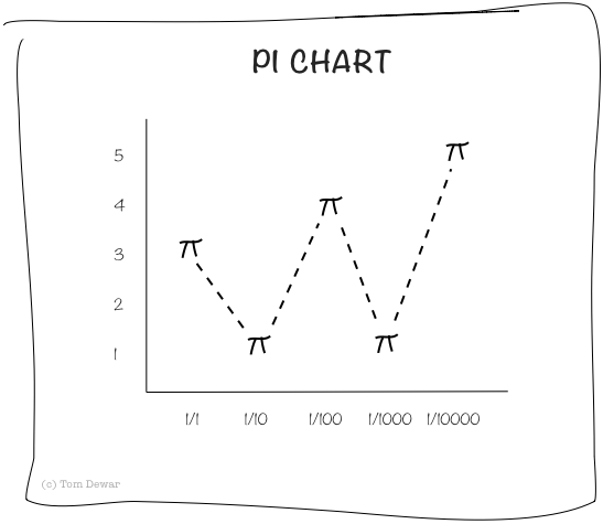
Pie charts are rarely acceptable

pi-chart.png

Cost saving vs. efficiency

Consider the following simplified scenario. You manage a team.  The team consists of four senior bods (let’s call them B‘s) and one junior admin support bod (let’s call them A).  The team works efficiently with the B‘s fully utilised doing work that only a B can do and A taking messages, organising meetings, taking minutes and the like. The B‘s cost you £50k per year a piece; A costs you £25k. So your total cost is (please excuse the maths-speak): 4B + A = 4(50k)+25k = £225k.  And because, in this idealised scenario, the team is perfectly efficient let’s accept that it provides the same 4B + A = 4(50k)+25k = £225k of value.

Now imagine that austerity is biting and you are being asked to find at least 10% in cost savings. (If you work in the public sector this will, by now, be ringing bells.) You decide there is nothing for it, A will have to go and your B‘s will have to “absorb” that admin work: take there own messages, organise their own meetings, write their own minutes. £25k saving right? Result. Or is it?

Let’s take a closer look at your new world. Yes, undoubtably your costs have reduced by £25k, but what has happened to the value?

You look closer and you notice that each of your four B‘s is now spending the equivalent of a day a week doing the stuff A used to do. So each of your B‘s now spends 20% of their time doing £25k value stuff… but your still paying the £50k cost for that time. Financially, your team is now considerably less efficient. How much so? Well, your costs are down to 4B = 4(50k) = £200k.  But your team’s value has reduced to 4(80%(50k)+20%(25k)) = £180k.

You’ve cut £25k off your costs, but in doing so, you lost nearly double that – £45k – in value.

Moral of the story? When you’re cutting costs, always have an eye to the value you may be destroying.

Data presentation matters

In my trade there’s a stereotypical tendency for analysts to spend too much time on the analysis and not enough time on the presentation. You might have done the best bit of analysis in the world, but what’s the point if your customer doesn’t get it? Most people don’t want to wade through pages of ill-formatted spreadsheets or tables of figures. (And don’t get me started on Excel default charts.) They’ve got decisions to make and little time to spare. As a rule of thumb I’d say that if your customer hasn’t understood what your analysis is telling them within 60 seconds of seeing it, you’ve probably failed.

And when it comes to presenting your data I’ve yet to come across a better tool than Tableau. It’s not the perfect tool for every job, but for exploring data, looking for patterns, data presentation, usability and all-round lushness it’s just excellent.

Tableau screenshot

I produced this example over a couple of lunchtimes. It’s based on some publicly available NHS data – a single CSV file – kindly mashed together by Carl Plant (@carlplant) and published on his own site here. In total it probably took my a little under an hour, but I had the main map image above within five minutes. It really is that quick to use.

And if you have the tools to produce something this slick this quick, there really is no excuse for poor presentation any more.

Gypsie Rose Invoice

During the second world war, the allies worked out a rather nifty way to estimate the number of tanks the Germans were producing. It was based on the serial numbers gleaned from a handful of captured enemy tanks. They used a statistical trick which exploited the fact that the serial numbers were sequential. If two captured tanks had serial numbers 000123 and 000200, they knew that there were at least 200 – 123 = 77 other tanks built. A handful of captured tanks acted as a random sample of all tanks and all it took from there was a little applied statistics. The method was surprisingly accurate, and orders of magnitude more so than human intelligence estimates.  (This was verified after the fact by captured German documents of real production numbers.)

Interesting? Certainly. Relevant today? In certain circumstances, yes. The same technique could (and I expect probably is) used today by companies wanting to know how many widgets their competitors are producing. Check out the serial numbers on a random selection of their products on store shelves and, assuming these have a sequential pattern about them, hey presto. You can have have a pretty good idea of how many widgets your competitor is churning out.

If that all sounds a bit complicated, let me show you a much simpler trick which any manager might apply. It requires no more complicated maths than the ability to subtract one number from another.

Say you have a regular invoice from a company, a weekly or monthly bill for agency staff perhaps. Note the invoice numbers. They will almost certainly be sequential. The difference between your successive invoice numbers will be the number of other invoices that company has issued between times. Record the differences over time and you can get an idea as to whether their business is growing or shrinking, and at what rate.

If you have a lot of different regular invoices from the same supplier, you might even try working out what share of their business you constitute. Say you have 10 different monthly invoices and, using the method above, you think they only issue 50 invoices per month, that suggests you are 20% of their business.

Might be useful to know before negotiating those prices next time.

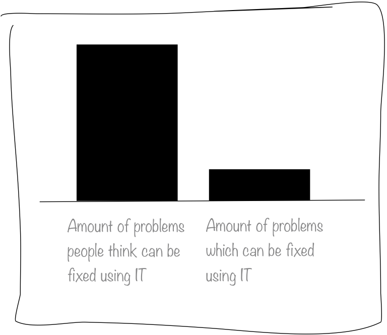
IT as saviour

Doodlechart 001

Winter negotiations ABC

Ah, it’s a new year.  Must be time for another fun round of SLA negotiations.  For those of you unfamiliar with this annual jamboree, it is the time when those who hold the NHS’s purse strings (commissioners) sit down across the table from those who spend the purse (providers) to draw up a contract which will ultimately decide who ends up holding the deficit.

On a less flippant note, here are my top three pre-match notes to self.

  1. A realistic activity plan.  When agreeing next year’s activity plan, try try try to end up with something which differentiates impartial forecast from wishful thinking.  The starting point for any plan must be a cool analytical assessment of the minimum activity likely to be required, not simply how much can be afforded. Glossing over this by agreeing to a plan you don’t believe is not saving you time, it is wasting you time: you’ll only end up having a fight later in the year by which time it will be too late to do anything constructive about it.
  2. Priniciples & definitions.  Accepting your contract will include performance metrics with financial penalties, agree both the principles of these (what is the logic for their application) and their technical definitions (exactly how are they measured and applied).  Having a tightly agreed definition helps avoid in year arguments about what performance is and whether or not a penalty applies. Where arguments do arise, having agreed principles in place can help settle them more amicably.
  3. Clinical involvement.  Get clinicians (on both sides) involved as early as possible. Ditto service General Managers or equivalent. This is the best way to make sure your plans and targets are sensible, believed and understood by those with the power to change practice.

Every journey starts with a single step

This blog is intended as a dumping ground for my thoughts on a variety of things.  The NHS, in which I work.  The dark arts of analysis, in which I engage.  The foibles of human decision making.  Serious stuff.  Not so serious stuff.  Hell, I may even chuck in the odd photo or doodle.

At best I hope others will find something of interest or use in the blogs to follow.  At worst, well this is as good a place as any to record some notes-to-self.