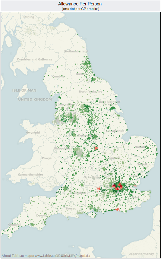
In my trade there’s a stereotypical tendency for analysts to spend too much time on the analysis and not enough time on the presentation. You might have done the best bit of analysis in the world, but what’s the point if your customer doesn’t get it? Most people don’t want to wade through pages of ill-formatted spreadsheets or tables of figures. (And don’t get me started on Excel default charts.) They’ve got decisions to make and little time to spare. As a rule of thumb I’d say that if your customer hasn’t understood what your analysis is telling them within 60 seconds of seeing it, you’ve probably failed.
And when it comes to presenting your data I’ve yet to come across a better tool than Tableau. It’s not the perfect tool for every job, but for exploring data, looking for patterns, data presentation, usability and all-round lushness it’s just excellent.
I produced this example over a couple of lunchtimes. It’s based on some publicly available NHS data – a single CSV file – kindly mashed together by Carl Plant (@carlplant) and published on his own site here. In total it probably took my a little under an hour, but I had the main map image above within five minutes. It really is that quick to use.
And if you have the tools to produce something this slick this quick, there really is no excuse for poor presentation any more.

